

Trendpop Components
A hybrid system designed to fit product and team needs
Role
Lead Product Designer
Skills
UI, UX, branding, design systems
Year
2023 - 2025
WHAT’S THE POINT?
When I joined Trendpop as the only designer, the product didn't have an official logo or branding, let alone a design system. We were a small and lean team of 10. Instead of starting from scratch, we leveraged MUI (Material UI) . I call it a hybrid design system. We used a lot of MUI components and customized ones to our product needs.
I want to zoom in and focus on Trendpop’s core components, rather than the whole system itself. The product utilized many different types of cards and tables. We also had an ever-evolving nav bar that kept growing with more product features. Those are the components I want to touch on, since those had the most impact on Trendpop’s system.
Components
〰️
Components 〰️
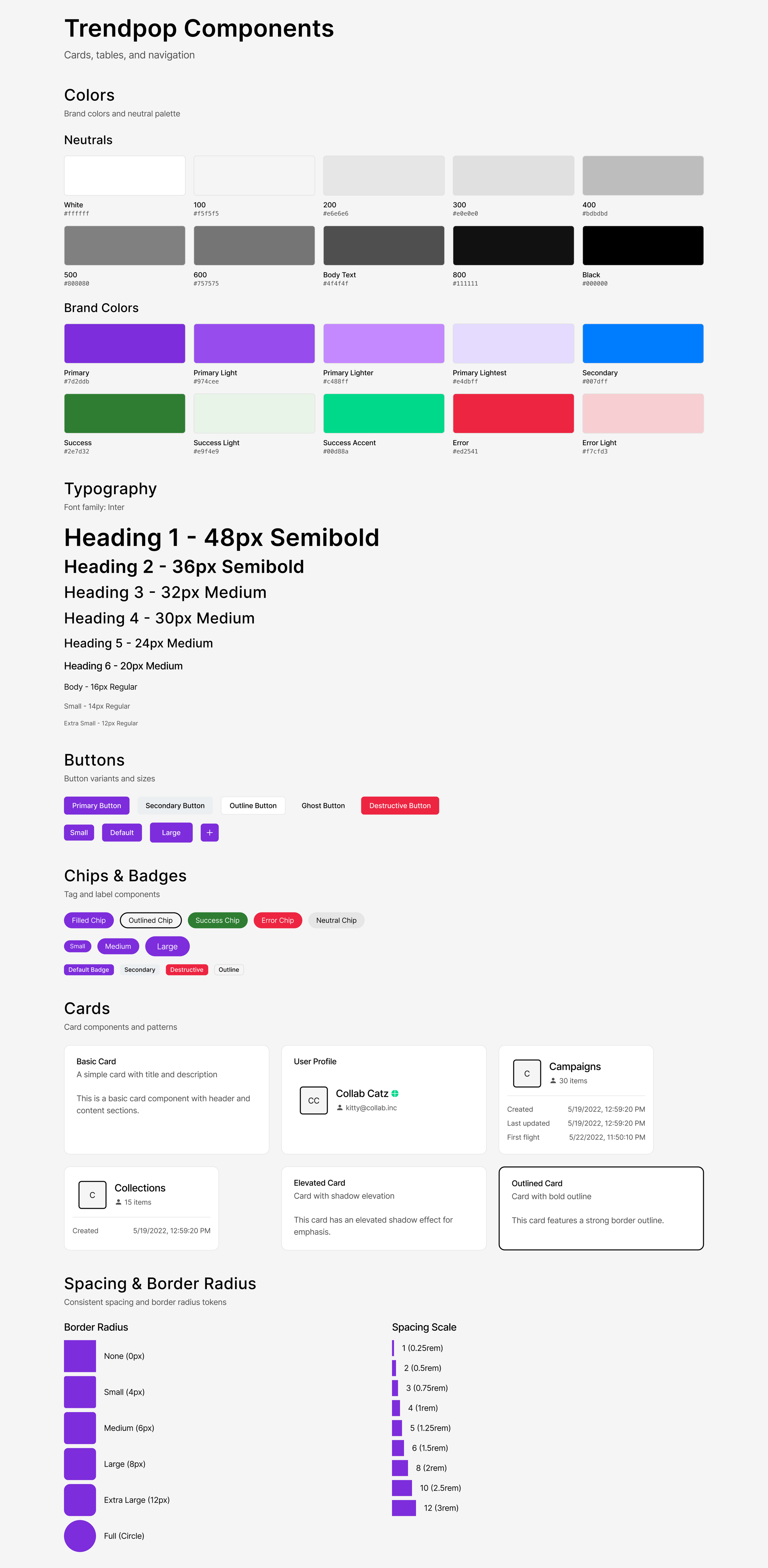
Mini component system built with Figma Make
Trendpop's component system was designed in Figma using Figma Make, and is built around a clean, modern aesthetic using the Inter typeface and a structured token-based approach to color, spacing, and shape.
Figma Make allowed for rapid, iterative component building directly within the design environment, making it easy to establish consistency across patterns while keeping the system tightly connected to the design file from the start.
TABLE COMPONENT
➡ Tables track performance across different categories like videos, creators, sounds, hashtags, songs, artists and albums across TikTok.
➡ The system utilized over 30 variants of table items.
Core scenario
A music marketer logs into Trendpop to understand how a new single is performing across user‑generated content. The marketer needs to see which videos, creators, sounds, hashtags, and pre‑release assets are driving views and engagement so they can double down on what works and adjust spend and messaging quickly.
Challenges
〰️
Challenges 〰️
Inconsistent data availability
Incomplete data from the source system.
Status with varying states
Multiple colored badges that need dynamic styling based on data conditions.
Mixed data types
The tables combine text, numbers, percentages, dates, status badges, and visual elements (profile images, icons), requiring careful type handling and formatting.
Nested information
Creator profiles show multiple pieces of info (username, subscriber count, platform icons) in compact cells.
Wins
🎉
Wins 🎉
Standardized UI and Layouts
Standardized table patterns make the UI easier to pick up, so new marketers, label partners, and artist teams can onboard faster. Consistent layouts and export‑friendly tables also make it easier to build end‑of‑campaign decks.
Easy Prioritization
Creators and sounds tables make it easy to prioritize partners and trends with proven engagement. Structured columns give A&R, marketing, and partnerships a shared source of truth when building campaign briefs and getting stakeholder buy‑in.
Stronger Link from TikTok to Streams
Tables that connect creator, video, and sound performance to songs, artists, and albums help teams clearly see which UGC activity is actually driving streaming and revenue outcomes.
Faster Campaign Decisions
The unified tables reduce time to insight by surfacing all key metrics in one view instead of across multiple tools or exports.
CARD COMPONENT (Discovery)
➡ Cards are similar to tables. They track the same types of data but displayed in a presentable square or rectangular package.
➡ The system utilized over 50 variants of card items in 12 different categories.
Challenges
〰️
Challenges 〰️
Multiple Orientation Variants
Each card type has both vertical and horizontal layouts.
Information Overload
Cards pack multiple data points into small spaces.
Text Truncation
Long titles, descriptions, and usernames need ellipsis handling that works across languages and font sizes.
Variable Card Heights
The "Long" variants contain significantly more content, creating challenges for grid/list layouts with mixed heights, scrolling behavior consistency and content truncation.
Wins
🎉
Wins 🎉
Faster Discovery
Vertical and horizontal cards expose only the most important metrics (followers, views, engagement, badges). Compact layouts let users scan large sets of cards like a “catalog” of options, speeding up trend and partner discovery.
Smoother briefing and inspiration
Video cards with thumbnails, copy snippets, and labels like “Most Viewed” double as creative references, giving content teams concrete examples of what “good” looks like without opening separate tools.
Higher-quality campaign picks
Performance‑rich cards (e.g., “Original”, “Macro”, view counts, growth deltas) nudge teams toward data‑backed choices, improving odds that each selected creator or sound will perform.
Better collaboration across our internal team
The cards are modular and reusable, our team can deploy them across discovery, campaign planning, and reporting surfaces, keeping the experience cohesive while lowering design and engineering overhead.
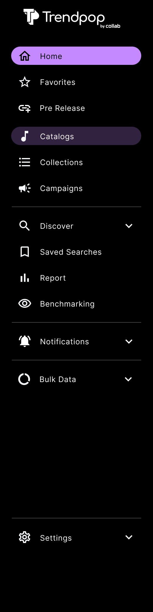
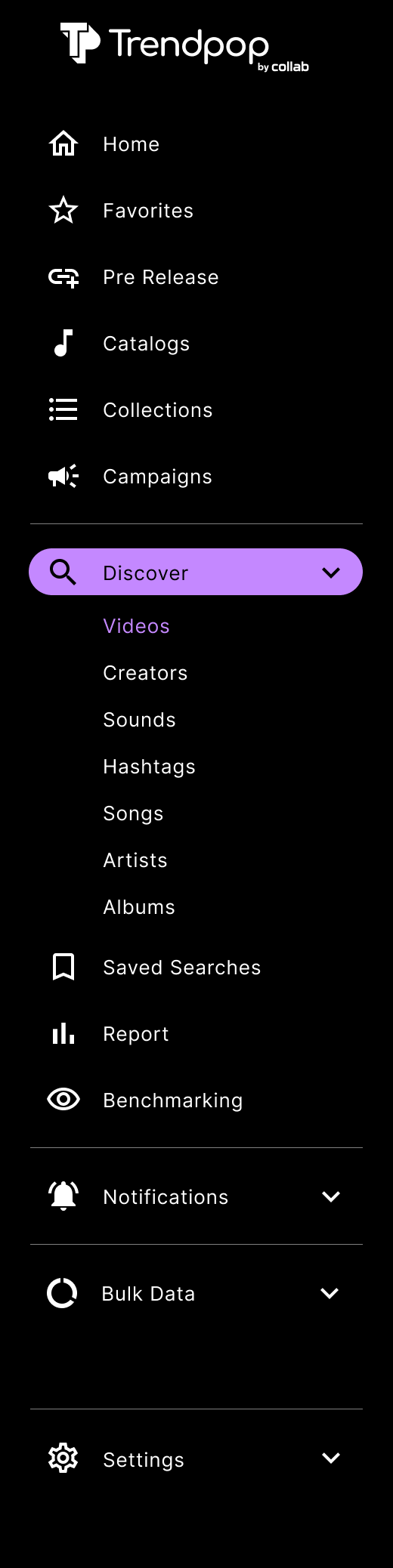
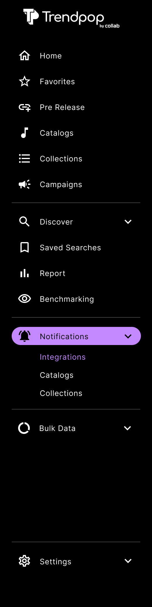
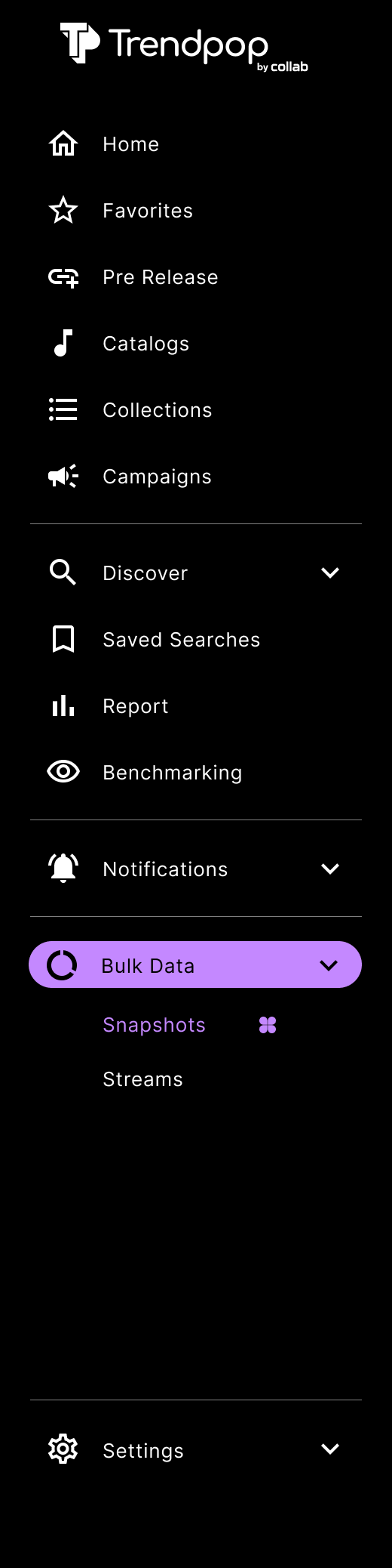
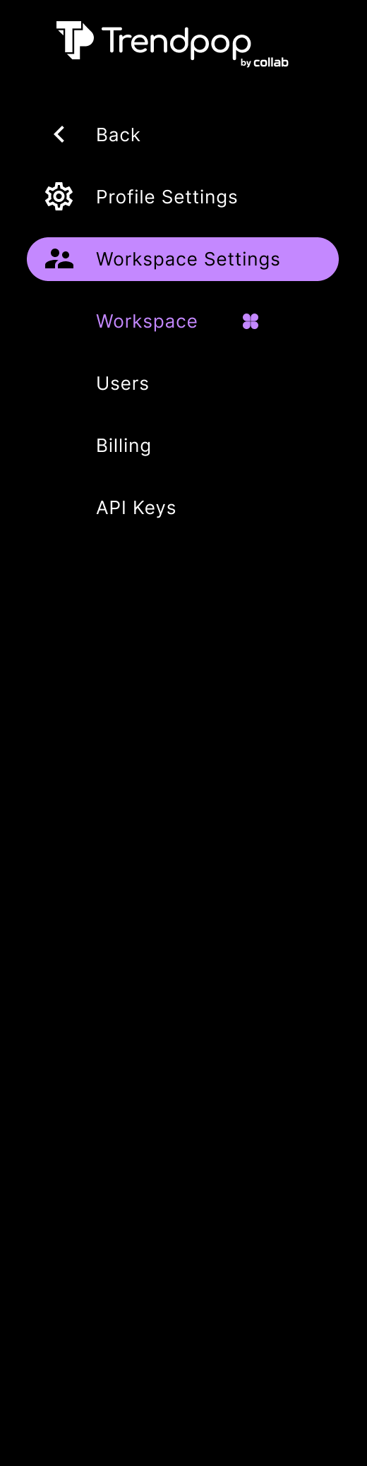
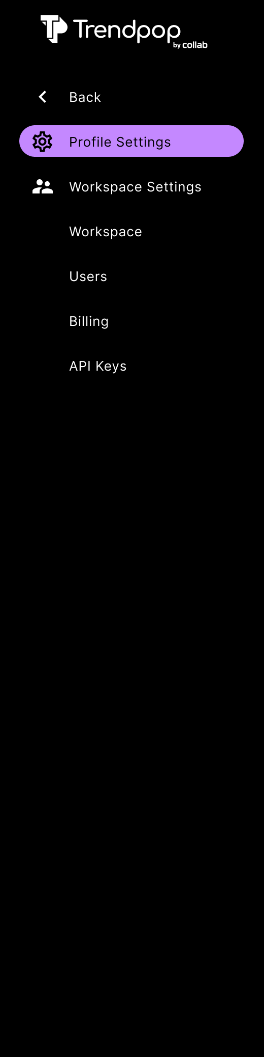
NAV COMPONENT
➡ The left side nav gives quick, consistent access to primary sections like Home, Favorites, Catalogs, Creators, Campaigns, Deep Search, Reports, Notifications, Bulk Data, and Settings, so the user can move between discovery and analytics without losing context. It’s collapsible and uses nested components, to free up viewing space.
➡ The system utilized over 28 variants of nav bars.

Challenges
〰️
Challenges 〰️
Information Architecture
Many primary and nested items (Home, Favorites, Catalogs, Creators, Campaigns, Deep Search, Reports, Notifications, Bulk Data, Settings, plus sub‑sections) make it harder for new users to form a clear mental model of what lives where.
Responsiveness and Space Constraints
Long section names and nested drop-downs risk truncation or wrapping, which hurts scan‑ability and may break layout in localized versions or at different zoom levels.
Accessibility and theming
Dark theme with subtle gray text and dividers can lead to insufficient contrast for labels and hover/active states, especially for low‑vision users.
State and Variant Management
Multiple variants (basic, sound‑focused, full, settings) mean more design‑system overhead to keep icons, labels, and active states consistent across all navs and breakpoints.
Outcome
By utilizing these navigation components, the user can move from a high-level Campaign view to a granular Hashtag search in just two clicks, ensuring they can react to real-time social media trends as they happen. Trendpop had a lot of product features to offer. We organized the subsections as easy to understand as possible for the user to navigate.
IN THE END
Despite many challenges, Trendpop’s goal is to move fast, fail quickly. As a small team, we benefitted more working this way.